Smart Colour Choices: How to Paint Rooms with Purpose in Mind
The colours you choose for your walls can do more than just beautify your space; they shape mood, energy and even daily productivity. With smart colour choices, every room in your home can serve its purpose better, whether it’s creating a calm bedroom, a lively kitchen or a focused home office. Thoughtful room painting ideas allow you to match colours with emotions, functions and lifestyle needs. By choosing paint colours for home wisely, you can transform ordinary rooms into purposeful spaces that truly reflect comfort and style.
Why Colour Matters in Home Design
Colour is more than decoration, it sets the tone for how you feel in a space. Interior designers often highlight the power of colour psychology for interiors, showing how shades influence mood and behaviour.
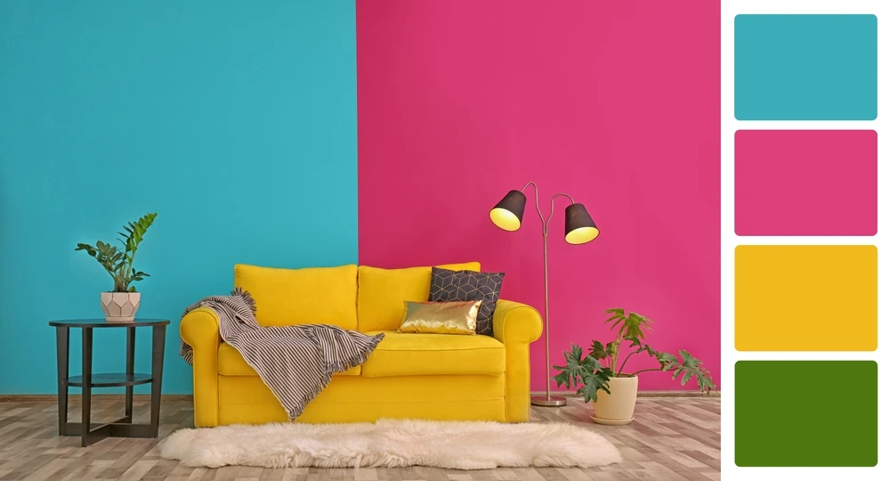
- Warm colours like red orange or yellow bring energy and excitement. They’re ideal for social spaces such as living rooms or dining areas.
- Cool colours like blue, green or lavender promote calmness. These work well in bedrooms, bathrooms or reading corners.
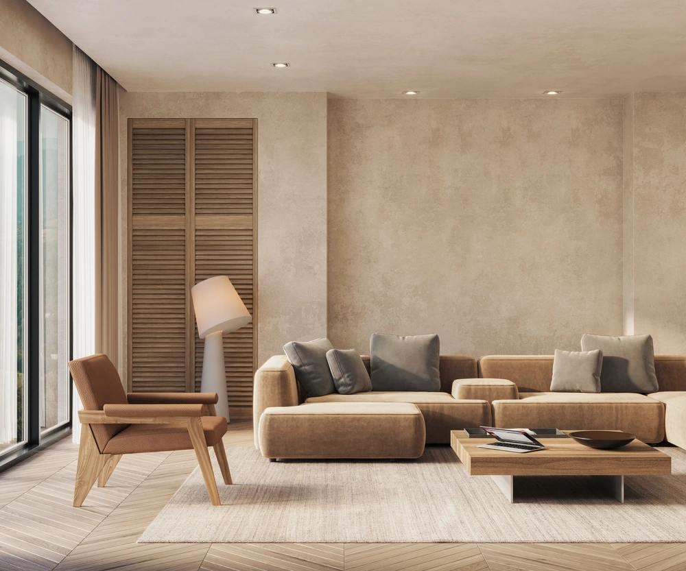
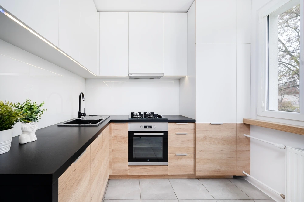
- Neutral tones such as beige, grey and white create balance. They provide flexibility for home paint ideas and match almost any décor style.
For example, painting a small study in soft blue can improve concentration, while a sunny yellow kitchen feels lively and welcoming. The impact of wall colours goes beyond style, it directly affects how you use and enjoy each room.
Painting with Purpose: Setting the Mood in Each Room
Each room in your home has a different purpose and colour plays a big role in defining that function. By using smart colour choices, you can create the right atmosphere that supports comfort, productivity or relaxation. Here’s how to select colours room by room.
3.1 Living Room: Warm & Inviting
The living room is often the heart of the home, where family and friends come together. Choosing warm paint colours such as beige, tan or soft yellow helps create an atmosphere of comfort and connection. These tones make the space feel open and welcoming.
For example, a living room painted in creamy beige with yellow accents can make gatherings feel cozy and enjoyable. This is why many living room paint ideas focus on warm tones that encourage conversation and togetherness in inviting spaces.
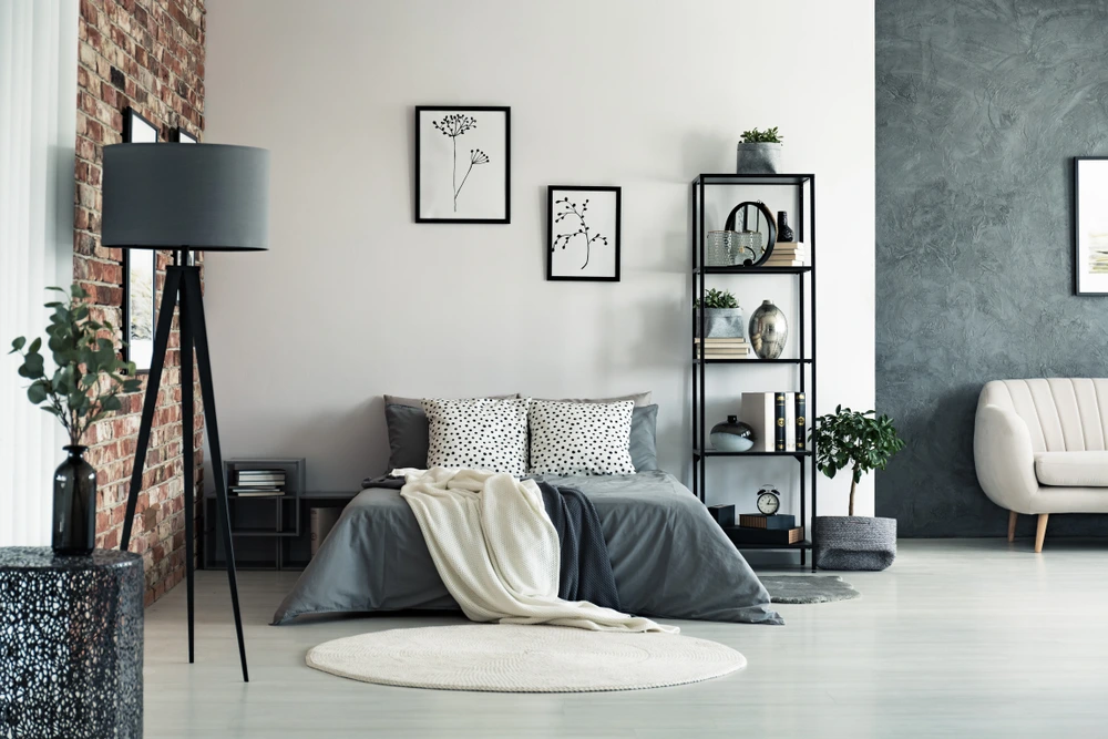
3.2 Bedroom: Calm & Relaxing
Bedrooms should be a sanctuary where you can unwind. Soft hues like lavender, pale blue and muted greens are ideal for creating calming room designs. These colours reduce stress and make it easier to fall asleep.
Imagine coming home after a long day to a room painted in gentle sky blue, it instantly feels serene. With the right bedroom paint colours, you can design a restful environment that supports deep relaxation and better sleep.
3.3 Kitchen & Dining: Energetic & Welcoming
The kitchen and dining areas are places for energy and connection. Bright shades like light yellow, leafy green or even subtle reds can encourage appetite and spark lively conversations.
A kitchen painted in soft green, paired with a sunny yellow dining nook, feels fresh and inviting. These kitchen paint ideas and dining room colours are perfect for families that enjoy mealtime together. The result is a space full of warmth, laughter and energizing interiors.
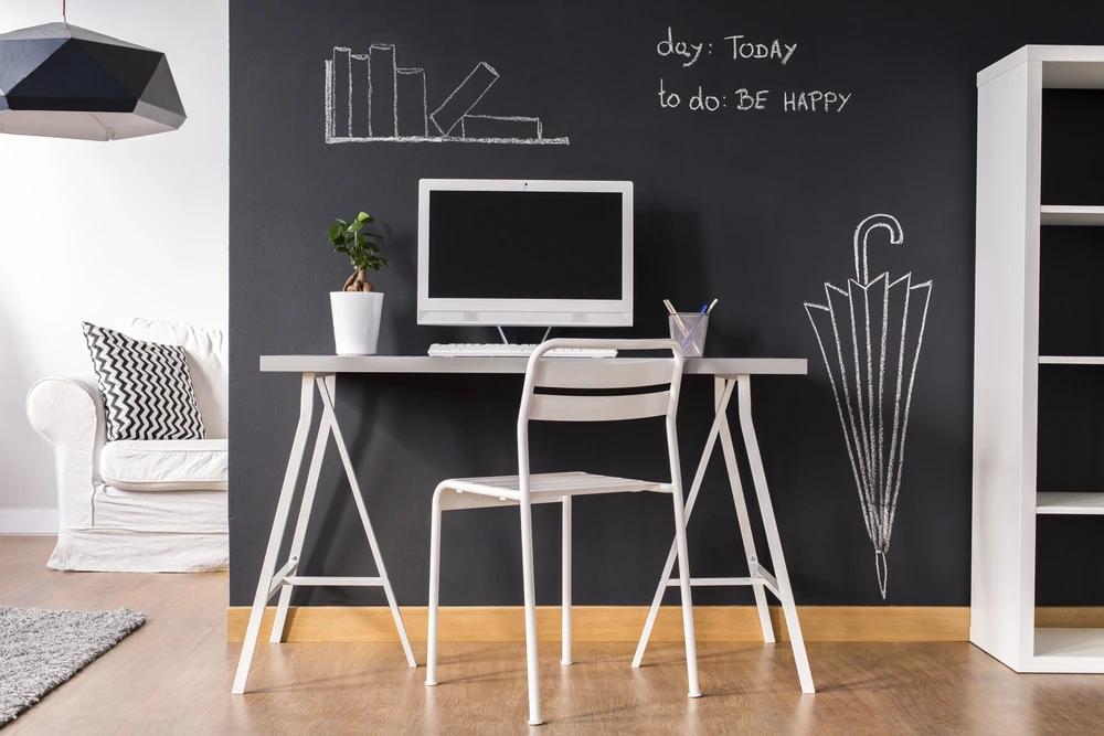
3.4 Home Office: Focus & Productivity
With more people working from home, a well-designed office is essential. Colours that boost concentration include muted blues, earthy greens and cool greys. These tones keep distractions low and motivation high.
For instance, a study painted in soft grey with green accents promotes focus while avoiding dullness. By using the right home office paint colours, you can create a productive workspace that supports creativity and efficiency. The right paint colours for concentration make all the difference.
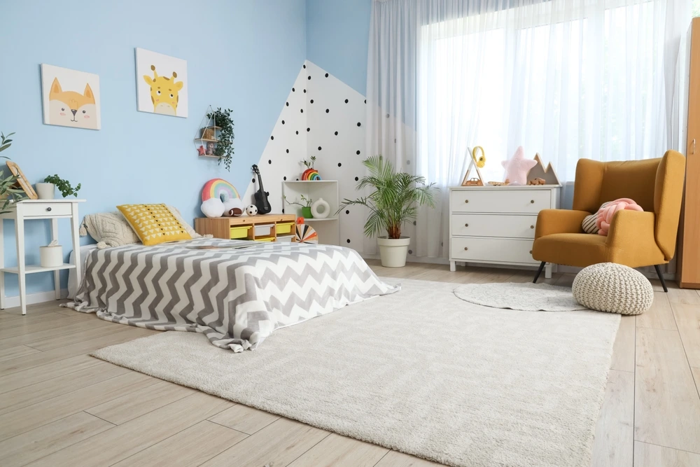
3.5 Children’s Room: Creative & Cheerful
Kids thrive in playful environments. Pastels and cheerful shades, like light pink, soft orange or mint green are perfect for stimulating creativity without overwhelming the senses.
Picture a child’s room with pastel yellow walls and colourful accents, it sparks joy while remaining restful. Many kids’ room paint ideas use fun tones that balance learning and play. With the right playful room colours, you can design a space where children feel both happy and safe.
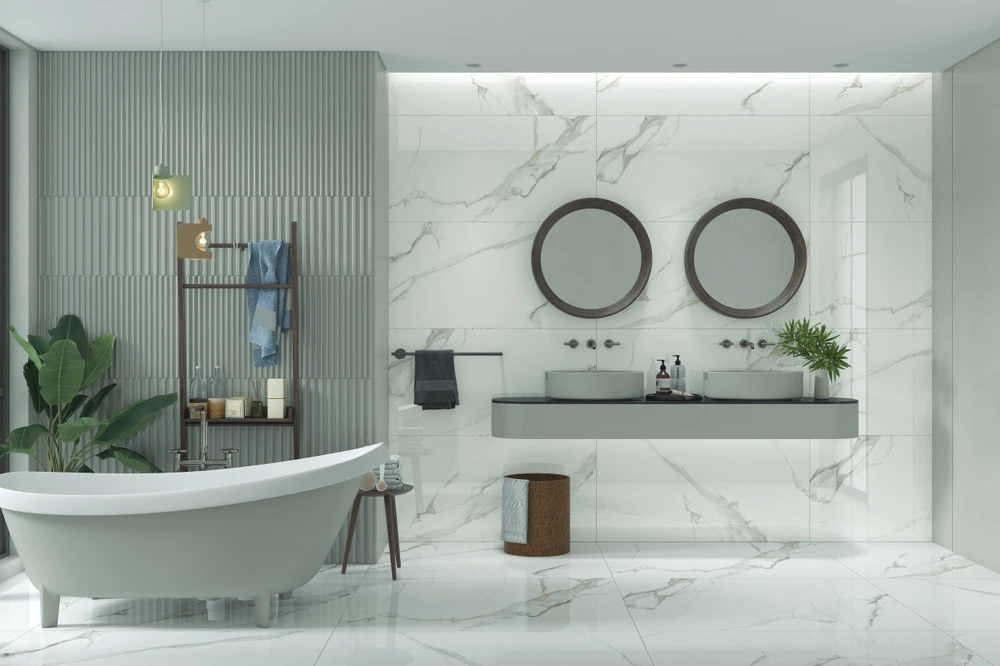
3.6 Bathroom: Fresh & Clean
Bathrooms work best with shades that feel clean and refreshing. Whites, aqua tones and light blues create a spa-like atmosphere that feels both soothing and hygienic.
A bathroom painted in crisp white with aqua details feels airy and bright, turning daily routines into calming rituals. Choosing the right bathroom paint colours can make small spaces feel larger while adding a touch of elegance. These shades are ideal for refreshing interiors that feel modern and relaxing.
Tips for Choosing the Right Colour Scheme
Selecting the perfect shade goes beyond just picking a colour you like. Thoughtful planning ensures your choice feels right for the room and works well long-term. Here are some colour scheme tips to guide you.
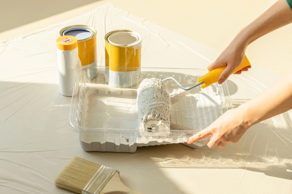
Test paint samples before committing
Colours can look very different on a wall than they do in a catalogue or online. Apply small patches on your wall and observe them at different times of day. This helps you see how natural and artificial light affect the shade before finalising.
Consider natural light and room size
Light plays a big role in how colours appear. Bright, sunlit rooms can handle darker shades without feeling heavy, while smaller rooms benefit from lighter tones to create an open look. These tricks are essential when choosing the right paint for each space.
Match colours with furniture and décor
A room’s walls should complement, not clash with your existing furniture and accents. For example, earthy tones pair well with wooden décor, while modern grey walls enhance metallic finishes. The right paint combinations help tie your room together for a balanced look.
With these simple yet effective steps, you can avoid costly mistakes and choose the best paint combinations that reflect both style and functionality.
Common Mistakes to Avoid
Even with the best intentions, many homeowners make simple interior paint mistakes that affect how a room feels and functions. Here are some pitfalls to watch out for when planning your next project.
- Overusing dark shades in small rooms
Dark colours can make a space feel elegant, but when used too much in a small room, they often create a cramped atmosphere. To avoid this, balance darker tones with lighter accents or use them only on feature walls. This helps you avoid wrong paint colours that make spaces look smaller. - Ignoring the effect of lighting
A colour that looks perfect in the store can look completely different at home. Poorly lit rooms can make shades appear dull, while bright lighting can exaggerate bold tones. Always test your colour under the same lighting conditions as the room to prevent costly repainting. - Choosing trendy colours without considering long-term comfort
Bold or trendy shades may look stylish at first, but they can quickly become overwhelming. For example, neon colours might be exciting now, but they may not suit your mood in a year. It’s better to pick versatile shades that you’ll enjoy long term and use trendy colours only for accents or accessories.
By keeping these common mistakes in mind, you’ll create rooms that remain comfortable, timeless and visually pleasing.
Actionable Design Tips
Painting isn’t just about picking colours. It’s also about how you apply them. With a few creative strategies, you can add depth and character to your rooms. Here are some practical interior design paint tips to try.
Use accent walls for creativity
An accent wall can instantly change the feel of a room without overwhelming the space. For example, a deep blue wall behind a bed creates a stunning focal point in the bedroom. Popular accent wall paint ideas include bold colours, geometric patterns or even textured finishes that bring personality to your space.
Mix neutral bases with bold highlights
Neutrals like beige, grey or soft white provide a calm foundation. Adding bold highlights, such as a bright sofa, colourful artwork or painted trim…brings energy and contrast. This mix allows you to experiment with colour without committing to dramatic walls.
Add textures with paint finishes
The finish you choose can be just as important as the colour itself. Best paint finishes like matte, satin or gloss each create a different effect. Matte works well for a smooth, modern look, satin offers subtle shine that hides imperfections and gloss adds brightness to highlight architectural details.
By combining these simple techniques, you can elevate your home’s design and make every room look unique, stylish and purposeful.
Transform Your Home with Smart Colour Choices
The colours you choose can completely change how a room feels and functions. By making smart colour choices, you create spaces that are not only beautiful but also purposeful. Every shade has the power to influence mood, energy and comfort.
Before painting, take time to think about the mood you want, the function of each room and how colours work with your style. These simple steps turn ordinary spaces into inspiring environments.
For flawless results, consider hiring our professional painting services that ensure precision and quality. With the right guidance and thoughtful planning, your next project can go beyond just paint…it can be a full home renovation idea that elevates your living experience.
Ready to refresh your home? Contact Mqoola Services today for reliable property care and AC maintenance solutions that bring your vision to life.
FAQs
Q1: How do I choose the right paint colour for my living room?
A: Start by thinking about how you use the space. For gatherings, go with warm paint colours like beige or soft yellow. They create a welcoming and inviting atmosphere.
Q2: What is the best colour for a small bedroom?
A: Light shades such as soft blue, lavender or pale green are ideal. These bedroom paint colours make the room feel larger and help create a calm, relaxing environment.
Q3: Are accent walls still a good idea?
A: Yes! Accent wall paint ideas are timeless when done tastefully. A bold shade or textured finish on one wall can add depth and creativity without overwhelming the entire room.
Q4: How does lighting affect paint colours?
A: Lighting changes the way colours appear. Natural light makes shades brighter, while artificial light can add warmth or dullness. Always test samples under different lighting before finalizing.
Q5: Should I hire professionals to paint my home?
A: While DIY is possible, expert painting services ensure smooth finishes, proper application and longer-lasting results. They also save time and reduce costly mistakes.